Editor guide
Learn where the controls are and how to build, fine-tune, and export a mockup.
The workspace
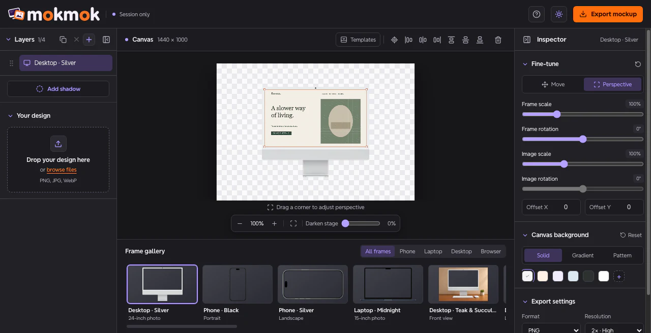
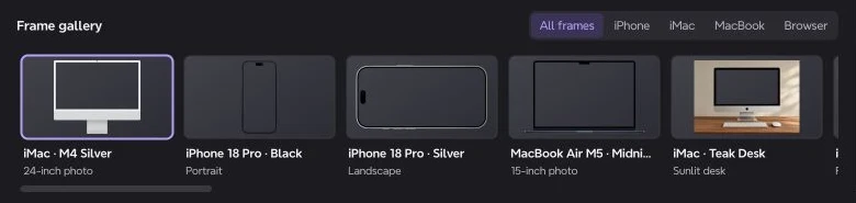
Select a frame in Layers on the left, arrange it on the canvas in the center, and adjust it in the Inspector on the right. The frame gallery sits below the canvas.
- Panel icons.
- Use the icon after Add in Layers or before the Inspector title to collapse or reopen that sidebar.
- Section chevrons.
- Click a section heading to expand or collapse its controls.
- Sun or moon.
- Switch the editor between light and dark mode. Your browser remembers the choice.
Frames and layers
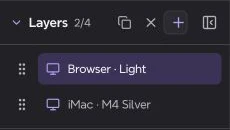
A composition can hold up to four layers. A layer can be a device or browser frame with its own screenshot, or a shadow.
- Add, duplicate, or remove.
- Use + to add a frame, the copy icon to duplicate the selected layer, or × to remove it when there is more than one layer.
- Reorder.
- Drag a layer by the grip at its left. The top layer appears in front on the canvas and in exports. You can also focus the grip and press Up or Down.
- Templates.
- Choose a category and click a thumbnail to swap the selected layer’s frame while keeping its screenshot. Use Templates above the canvas to hide or reopen the gallery.
- Add shadow.
- Use Add shadow below Layers, then drag it on the canvas. Select the shadow to adjust Width, Height, Blur, and Opacity in the Inspector. Drag it below a frame in Layers to place it behind that frame in the export.
Screenshots and browser URLs
Select the layer you want to edit, then open Your design.
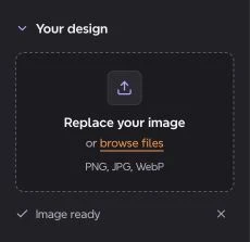
- Add or replace an image.
- Drop a PNG, JPG, or WebP into the upload area or click browse files. Use × beside Image ready to remove the image from the selected layer.
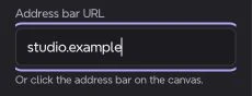
- Address bar URL.
- Choose a Browser template to show this field. Type the text you want in the mockup, or click the address bar on the canvas. Press Enter to finish an inline edit or Escape to cancel it.
Position and perspective
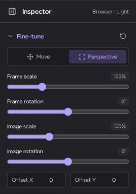
Use Fine-tune in the Inspector to adjust the selected layer.
- Move.
- Drag the frame to reposition it on the canvas.
- Perspective.
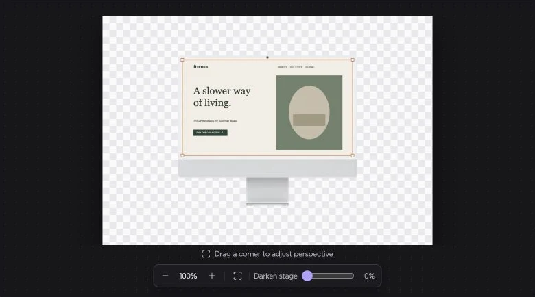
- Drag a corner handle to reshape the screenshot. The frame clips the image to the screen opening. Click empty space to hide the handles and select the frame to show them again.
- Frame scale and rotation.
- Resize or rotate the frame and its screenshot together.
- Image scale, rotation, and offsets.
- Resize or rotate the uploaded image within the frame. Use Offset X and Offset Y to shift it horizontally or vertically.
- Reset adjustments.
- Use the circular arrow beside Fine-tune to restore the corner handles, scales, rotations, and image offsets.
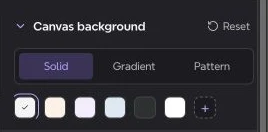
Canvas background
The background is part of the composition when you export with transparency turned off.
- Solid.
- Choose a swatch or click + to pick a custom color.
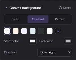
- Gradient.
- Set the start and end colors, then choose the direction.
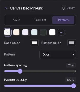
- Pattern.
- Pick Dots, Grid, or Diagonal lines. Set the base and pattern colors, spacing, and opacity.
- Reset.
- Restore the default canvas background and transparency settings.
Zoom and stage
The controls below the canvas change how you see the composition while editing.
- Zoom and Fit canvas.
- Scroll up over the canvas to zoom in and down to zoom out, or use − and +. Both update the same 25%–400% display. The Fit canvas icon returns the view to 100%.
- Darken stage.
- Adjust the area around the canvas. This slider leaves the exported background as you set it in Canvas background.
- Align.
- Use the icons between Templates and the trash can to center the selected frame or align it to a canvas edge. Alignment uses the frame’s current size and rotation and moves it along the chosen axis.
- Reset canvas.
- The trash icon above the canvas clears the current composition and restores the default frame and settings.


Export a mockup
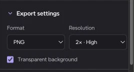
Choose your settings in the Inspector, then click the orange Export mockup button in the header.
- Format.
- Choose PNG, JPG, or WebP. PNG and WebP can export with transparency. JPG always uses the selected canvas background.
- Resolution.
- Choose 1× for 1440 × 1000, 2× for 2880 × 2000
- Transparent background.
- Turn this on for a transparent PNG or WebP. The checkerboard is a preview of transparency.
- Full-resolution frames.
- If the editor asks you to load the frame photos, select each photo layer and wait for it to load, then export again.